
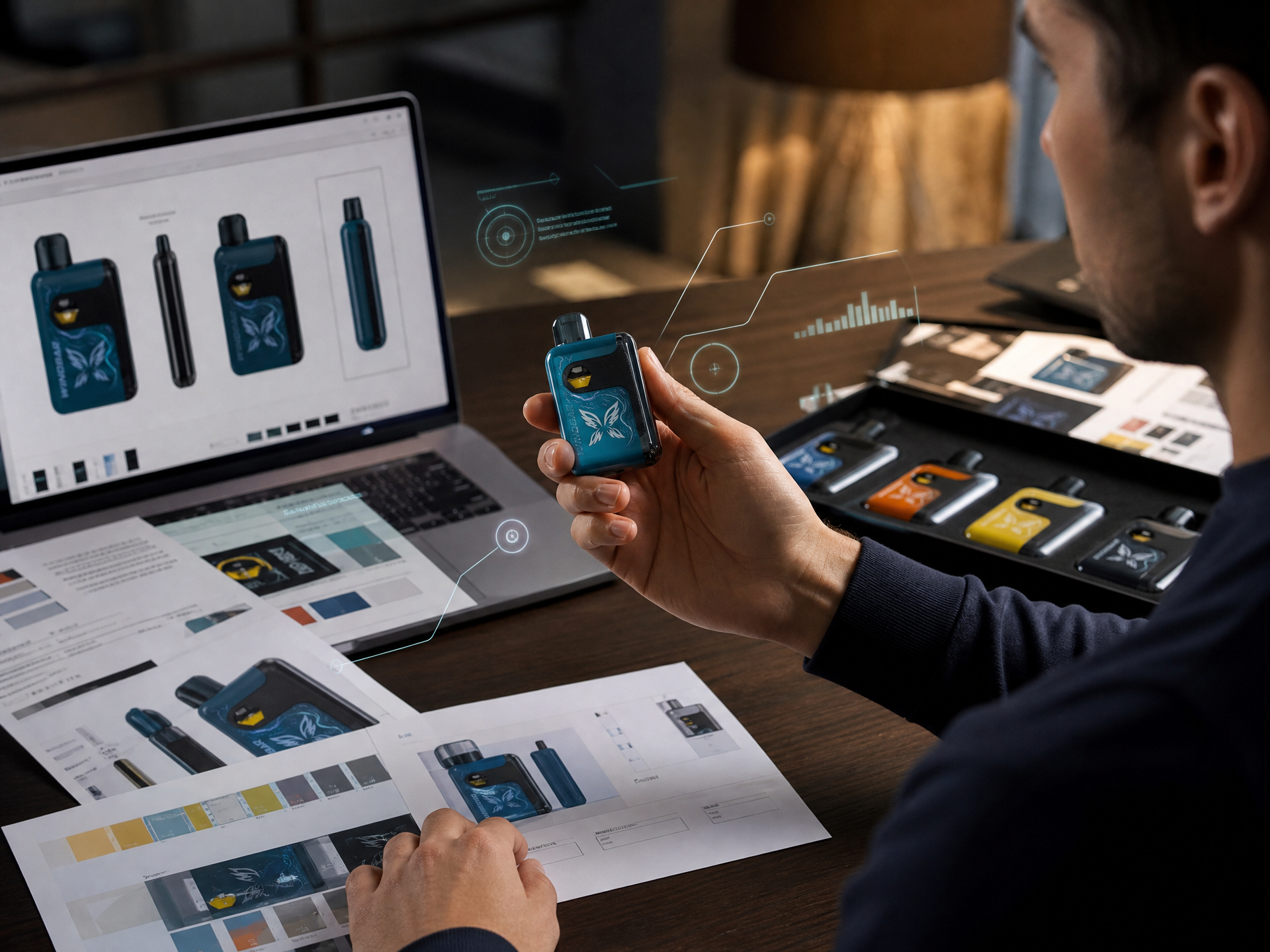
Most vape packaging fails before anyone reads a single word on it.
Here is the uncomfortable truth about visual hierarchy: your brain processes packaging in a fixed sequence, and you cannot override it. You can only work with it or fight it. Most brands fight it. They lose.
The eye hits a package in this order: color, shape, image, headline, subtext, details. That is the chain. If you bury the brand name in the "details" slot and put a gradient in the "color" slot, congratulations. Your customer's brain registered the gradient and moved on. Your brand name never happened.
This is not opinion. It is neuroscience. The human visual cortex processes color in 13 milliseconds. Text takes 10 times longer. By the time someone reads your product name, they have already decided whether to keep looking.
Here is how to build a vape package that actually works.
Start with the dominant color block. Not a gradient. Not a pattern. A single, recognizable color that owns the shelf. Think about it: when you picture a major vape brand, you see a color before you see a logo. That is not an accident. That is visual hierarchy doing its job.
Next: the silhouette. Square boxes, tall boxes, rounded containers, blister packs. The shape registers before the content. If your box looks like every other box, the brain files it under "same as before" and moves on. A distinctive shape buys you an extra half-second of attention. That half-second is everything.
Then the logo. Not the product name. The logo. The logo is the fastest visual shortcut to brand recognition. It should be the largest single element on the front panel. If your product name is bigger than your logo, you have the hierarchy upside down. The logo says "who." The product name says "what." Who comes first.
The product name comes fourth. Keep it short. Three words maximum. If your product is called "UltraMax Pro 20000 Puff Rechargeable Disposable Device," nobody is reading past "UltraMax." The rest is noise. Put the spec details on the side panel where they belong.
Below the product name: one distinguishing feature. Not five. One. "20K Puffs." "Mesh Coil." "USB-C Rechargeable." Pick the one thing that separates this product from the thing next to it on the shelf. That is your subtext.
Everything else goes on the side or back. Flavor descriptions. Full specifications. QR codes. Warnings. Compliance logos. All of it belongs somewhere that is not the front panel. The front panel is not a brochure. It is a billboard. Treat it accordingly.
Here is something most shops will not tell you: the bottom third of the front panel is the least valuable real estate. Hands cover it. Shelf lips cover it. If you put critical information there, it is invisible 80% of the time. Put the logo and product name in the top two-thirds. Let the bottom third carry the least important visual weight.
One more thing: the Nicotine Warning. It is required. It is ugly. It will destroy your visual hierarchy if you let it. The solution is not to hide it. The solution is to design around it. Give it a dedicated zone. Make it legible but visually subordinate. The warning exists. It does not need to be the hero.
The brands that win at shelf level understand one thing: packaging is not about what you want to say. It is about what the customer's brain will actually see, in the order it will actually see it. Respect the sequence. Build for the sequence. Everything else is just decoration. This content is intended for adults 21 years of age or older. Nicotine is an addictive chemical. The information provided is for educational and informational purposes only and does not constitute medical or legal advice. If you are considering using vaping products as an alternative to smoking, consult with a qualified healthcare professional. Product reviews and recommendations are based on publicly available information and independent evaluation; Windbar makes no representation regarding the FDA marketing authorization status of any third-party products mentioned. This content is not a substitute for review by a licensed attorney.
© 2026 Windbar. All rights reserved.